Module 7: Drillthrough, Buttons, Tooltip Pages
1 hr
Drillthrough
Drillthrough allows you to deep dive into your data by allowing you to pull out different related data points.
All you need to do is add the field you want to drill through to the Drillthrough filters well. Power BI then passes the selected value to the destination page and updates the visuals accordingly.
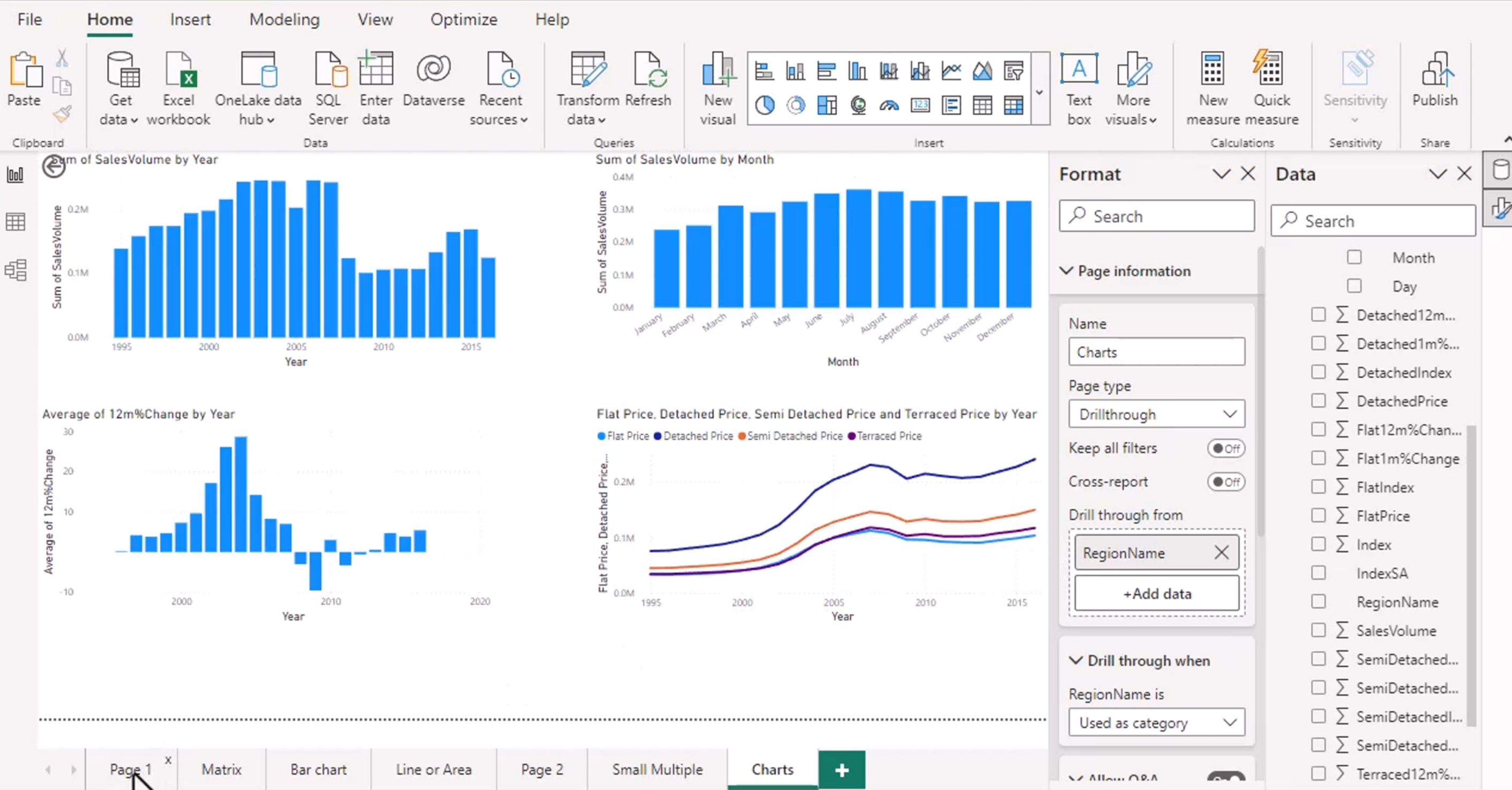
Drillthrough is different from drill down. With drill down, you stay in the same visual and move through levels of a hierarchy. With drillthrough, you go to a different report page that is designed to show more detail about the selected item.
For example, selecting a region in a summary chart could open a region-detail page containing sales, products, customers, and trends for that region. The destination page should contain visuals that use the drillthrough field so that the page is meaningful when a value is passed to it.
To use drillthrough, right-click a data point and select the drillthrough destination page. The available destination pages depend on the selected field and the drillthrough fields configured on each page.
Since it takes you to a different place, you want to eventually return to the place where you came from. In the upper left, the drillthrough page adds in a "back" button. This back button can be customized.
The back button returns the user to the source page and preserves the context of the original selection. Keep it in a consistent position and make its purpose obvious.
Buttons and Actions.
You add the buttons in first, then program them to do something with an action. Select the button, turn Action on in the formatting pane, and choose the action type and destination.
Common button actions include:
- Page navigation
- Drillthrough
- Bookmark navigation
- Back
- Web URL
- Q&A
Buttons are useful for creating report menus, moving between report states, and giving users an obvious way to return to a previous page.
You can add in images and allow them to have an action. Shapes and images can both become interactive controls, but the visual should communicate what will happen when it is selected. Don't add in a random shape or apply a back action to a forward button.
URLs need to have https:// in front of them. Test web links in Reading view to confirm that they open the intended resource.
Buttons can have different visual states, such as default, hover, pressed, and disabled. These states provide feedback and help users understand that the object is interactive.
Page Navigation and Drill Through Actions.
You can add page navigation so a button takes the user directly to another report page. This is useful for menus, summary-to-detail workflows, and reports with several related sections.
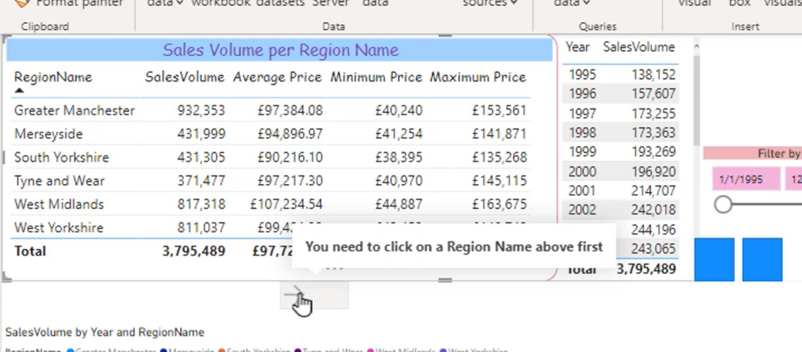
Page navigation is different from drillthrough because it does not require a selected data value. It simply moves to the chosen page. Drillthrough carries the selected filter context with it.
When designing navigation, group related pages together and use consistent labels. A user should be able to tell whether a button opens an overview, a detail page, or an external website.
You can change the text options for your buttons for each type of button. Hover can give you a hover, disabled can get you a disabled text.
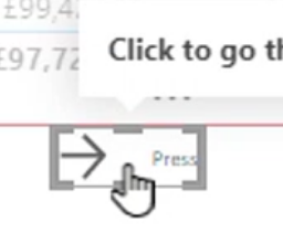
Use the hover state to reinforce the selected destination and the disabled state when an action is temporarily unavailable. You can also change the button fill, outline, icon, and text for each state.
Enable Natural Language Queries
Asking a question in addition to page formatting.
You can make a page be an answer to a question or a reference to a question.

Power BI's Q&A feature lets users ask questions about the semantic model using everyday language, such as "What were total sales by region last year?" Power BI attempts to interpret the question and create an appropriate visual.
This works best when field names and measures have clear, business-friendly names. Synonyms can also be added to the model so that terms used by report consumers match the names used in the data.
Natural language queries are helpful for exploration, but the results should be checked carefully. A question can be interpreted differently from what the user intended, especially when the model contains similarly named fields or ambiguous measures.
Tooltip Pages
Tooltips are small pop-up views that appear when you hover over items on a page. They provide extra context without requiring another page or taking up permanent space on the report canvas.
You can make a page a tooltip by selecting Tooltip as the page type.
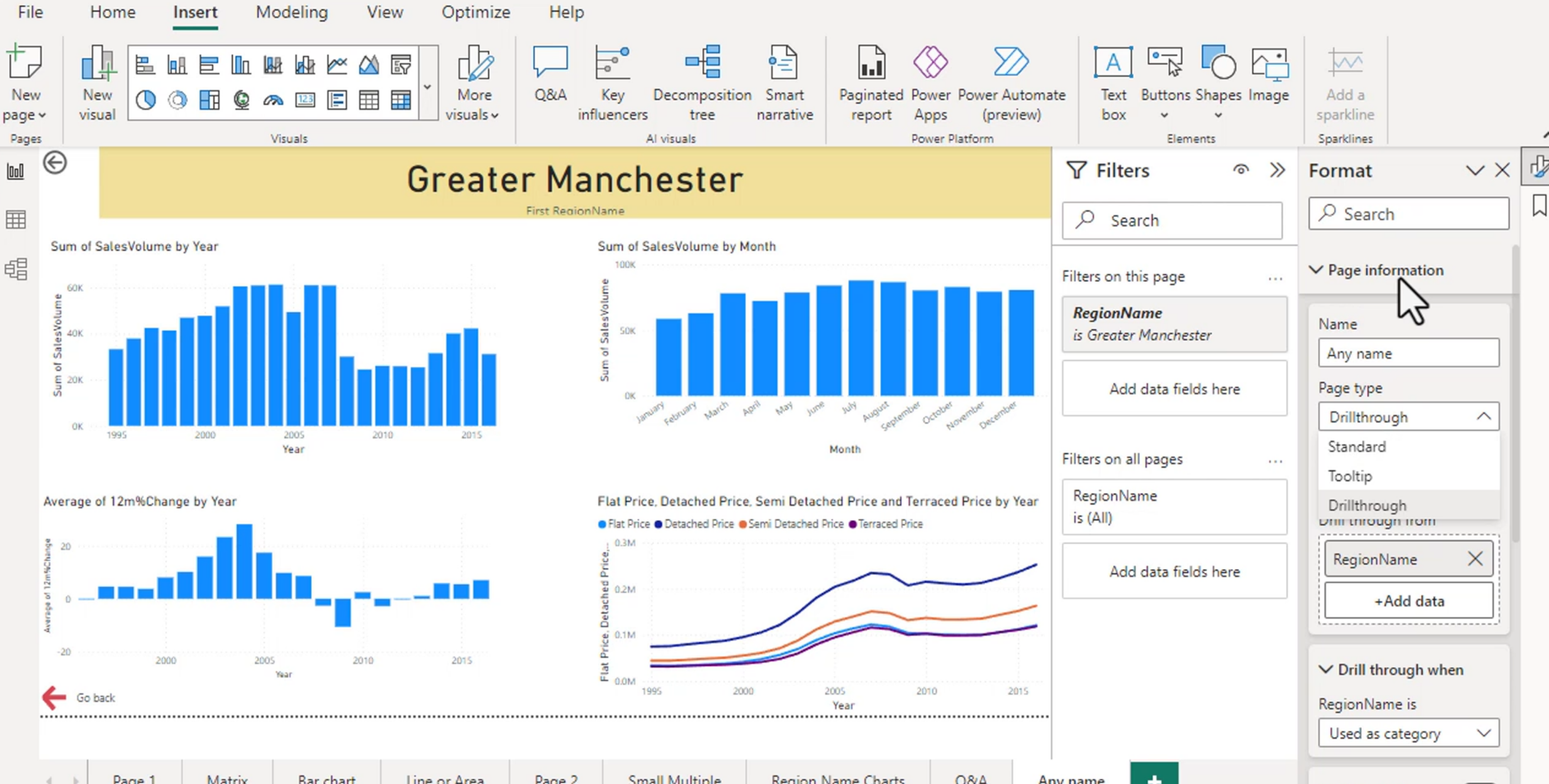
This is useful when a standard tooltip does not provide enough detail. A tooltip page can contain several visuals, measures, and explanatory text that are filtered to the data point being hovered over.
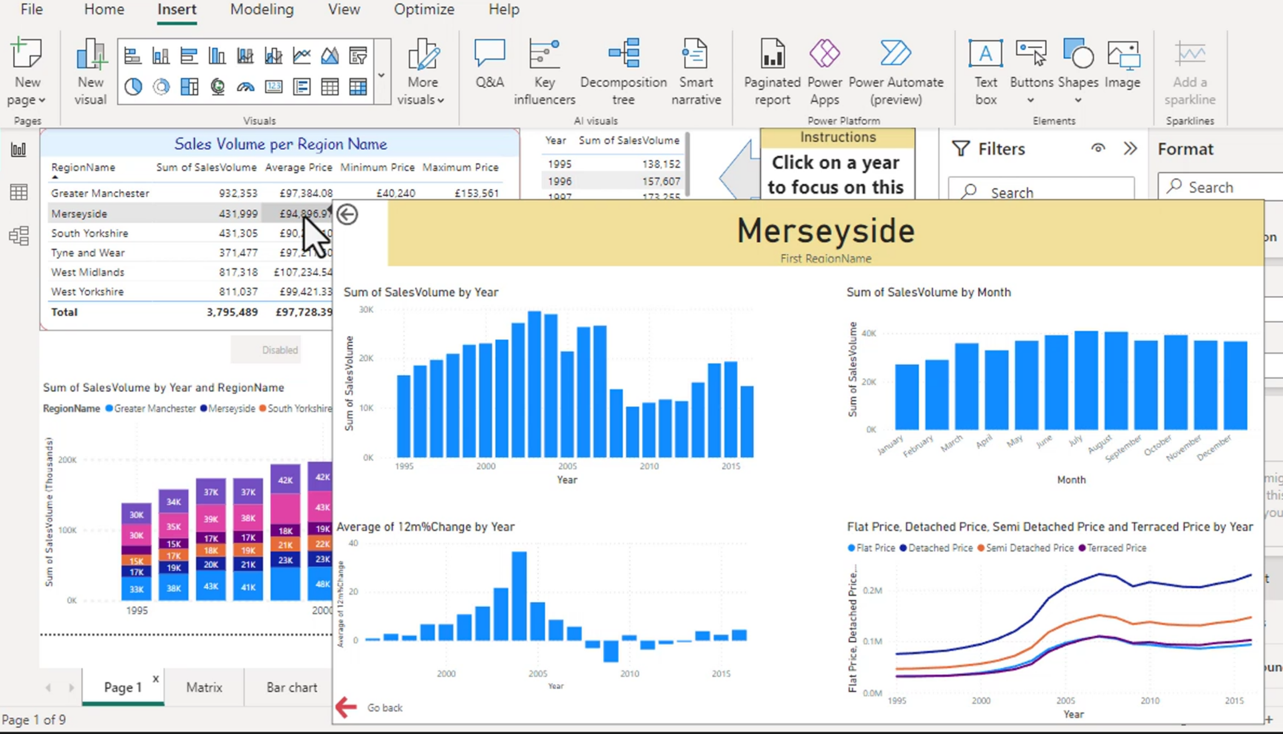
You can also decrease the size of the page by selecting the type under Canvas Settings. Select Tooltip to make a small window that fits naturally beside the data point.
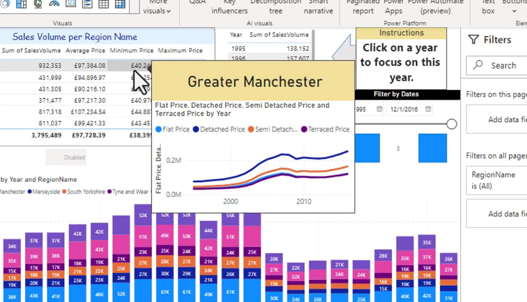
After creating the tooltip page, assign it to the source visual through the visual's Tooltip settings. The tooltip page must be configured for the fields and measures used by the source visual, otherwise it may show blank or unexpected results.
Keep tooltip pages simple. They should answer a quick follow-up question, such as showing the monthly trend behind a yearly total, rather than becoming a second full report page.
Page and Bookmark Navigator
You can create a navigator for your pages or your bookmarks. Page navigation is shown at the top of the navigator options, and bookmark navigation is shown below it.
Page navigators automatically create buttons for selected report pages. This is useful for menus because adding or renaming pages can be reflected in the navigator without manually rebuilding every button.
Bookmark navigators let users move between saved report states. Bookmarks can capture filters, slicer selections, visibility of objects, and the current report page, making them useful for showing alternate views of the same data.
Use a page navigator when the user is moving between report pages. Use a bookmark navigator when the user is switching between views or saved states on a page.
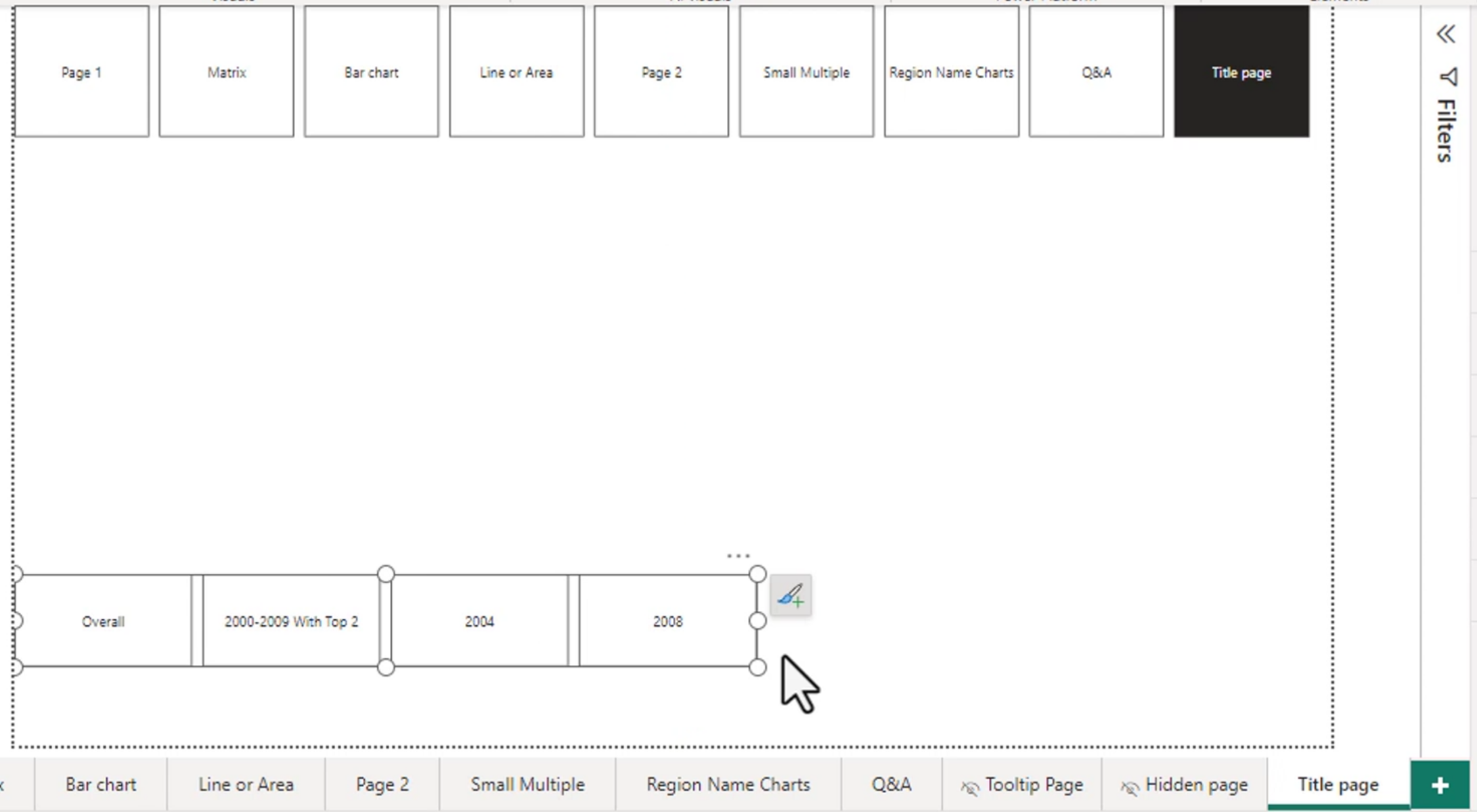
Useful for menus:
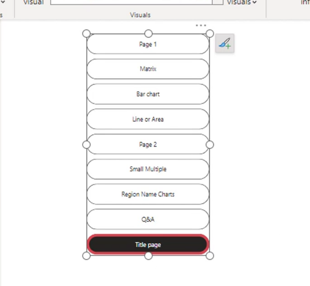
Format the navigator so the current page or bookmark is visually distinct. This gives users a clear indication of where they are and makes the report easier to navigate.
Quick Demo: Regional Sales Detail Report
This demo combines drillthrough, buttons, page navigation, a tooltip page, and a bookmark navigator in one small report.
1. Create the overview page
- Add a clustered column chart with
Regionon the X-axis and a measure such asTotal Saleson the Y-axis. - Add a card showing
Total Salesand a line chart showing sales by month. - Add a button navigator or page navigator so users can move between the report sections.
2. Create the drillthrough page
- Add a new page named
Region Detail. - Add
Regionto the page's Drillthrough filters well. - Add a table containing product, month, quantity, and sales.
- Add a chart showing the selected region's sales trend.
- Confirm that the automatic back button is visible and format it to match the report.
Return to the overview page, right-click a region such as West, and choose Drillthrough > Region Detail. The detail page should now show only the selected region. Select the back button to return to the overview.
3. Add a tooltip page
- Create a new page and set its page type to
Tooltipunder Canvas settings. - Add a small card for sales and a small line chart for the monthly trend.
- On the overview chart, set the Tooltip page to this new page.
- Hover over a region or data point to confirm that the tooltip is filtered to that point.
4. Add navigation buttons
- Add a button labelled
Overviewand set its action to Page navigation for the overview page. - Add a button labelled
Region Detailand set its action to Page navigation for the detail page. - Add a web URL button only when an external resource is needed, and include the full
https://address. - Test the default, hover, pressed, and disabled states in Reading view.
5. Add a bookmark navigator
- Create a bookmark called
All Regionswith no region selected. - Create another bookmark called
West Regionwith the West region selected. - Insert a Bookmark navigator so users can switch between those saved views.
- Check that the selected bookmark is visually distinct.
The completed flow is: select a region on the overview, hover for a quick tooltip, drill through for detailed analysis, use buttons to navigate, and use bookmarks to return to saved report views.